The Capsule mobile app is about helping you gain quick access to information you need, on the go. Performance has always been fast, but after listening to feedback, we agree, sometimes getting to the screens you need feels like one too many taps away.

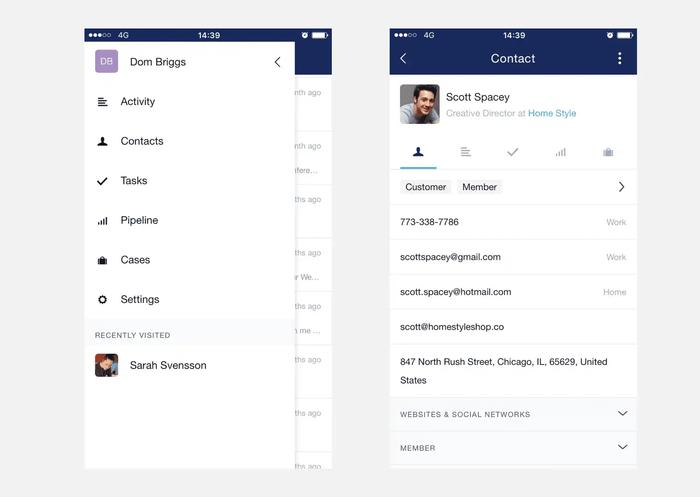
The current navigation sits behind a hamburger menu, a common design pattern amongst mobile apps. It's great for when you have lots of menu items and you want to save some space. The issue is that options are hidden until you open the menu. This also means you need to tap twice to get to any screen you need. Consequently when you visit a contact the menu is out of reach until you tap back to reach it again.
New tab navigation

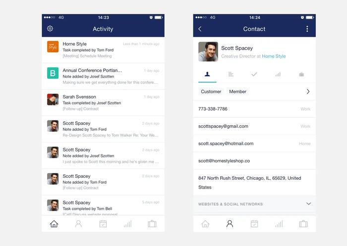
To speed things up we've completely redesigned the navigation to adopt a bottom tab bar. You'll find key screens now only a tap away. Even when you visit contact screens the menu is still with you, reducing the number of taps needed to go another screen. You'll also find settings now sits conveniently on the top left of the nav bar.
As a final touch, we've done away with the old icons to bring in some new fresh line icons across the app.
We hope you enjoy this update as much as we do! Please let us know if you have any questions.


