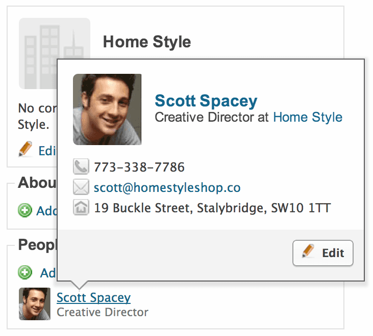
We've done some work to improve the use of the pop-over contact cards in Capsule. These are quick summary cards that save you clicking through to a contact's page when you just want their phone number or address. Previously these were activated by hovering over an icon next to the contact's name. We've simplified this so that you now activate the pop-over card by simply hovering over the contact's name in the link. This keeps the user interface for Capsule clean and increases the target area for activating the pop-over card. We've also made the UI more consistent by enabling this pretty much everywhere you see a contact's name in a link.
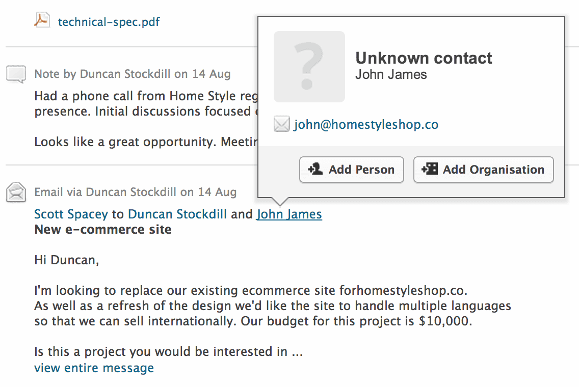
In addition we've converted the text from/to names that appeared at the start of an email entry into contact links that you can click and we've enabled the contact card pop-overs for these. If the contact doesn't already exist in Capsule (e.g. they were cc'd in the email) you can choose to add them, making it easier to add contacts that weren't automatically created by Capsule.
Finally, we've also tweaked the modal pop-ups that are used for things like task entry. These have been given a light refresh with new button styling to emphasise actions you are about to take.


