We started Capsule eight years ago with a mission to create a CRM system that’s simple, intuitive and powerful. Every year since we've been fortunate and grateful to experience continual growth in our business and customer base. While Capsule as a product has evolved, we've never taken the time to update the Capsule brand. We created our original logo at the start of the Capsule journey when we were just three people with a modest budget. As we look to the future we wanted a new brand that communicates who we are now and our ambitions.

Self-reflection
It was clear we needed more than an updated logo. We needed a completely new brand identity that could be applied consistently across everything we do. So we teamed up with Focus Lab to help us get it right. Focus have been on our radar for many years and their work on brands such as 500px and Udacity have been an inspiration.
From the very first meeting, we knew Focus were the right choice. Their creativity and confidence led us through some thought-provoking exercises. This discovery process provided an opportunity for self-reflection, asking questions of who we are? What represents us best? Who do we want to be? What makes us different? Focus helped us leave our comfort zone and explore different concepts. From Capsule as a container to constellations to space Capsules. All the while we tried to stay simple, approachable and trusted with a pinch of playfulness.
After many iterations, we clarified that Capsule isn’t a pill you take to cure your business ailments or some kind of metaphorical container. More than that, it's a powerful control panel to help you take care of your customers and business.
The new brand
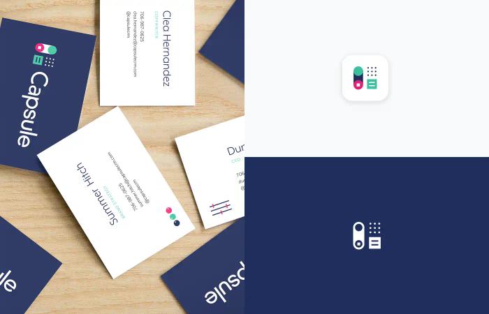
With a clear direction, the Focus team pushed on with the control panel concept. Focus posted some work on Dribbble that received a lot of love from the design community confirming we were on the right track. After several rounds of refinement with Focus, we arrived at our new logo.
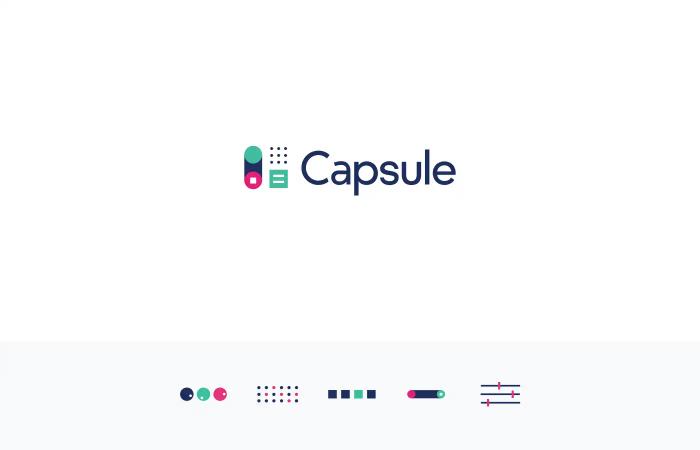
The new Capsule logo is unique, made up of switches and buttons to capture the essence of control over your business. Our new color scheme is vibrant and modern while feeling professional and trustworthy. With the logo in place, Focus completed our brand guidelines which define everything we need to know about our new brand, from typography choices through to voice and tone.
Going forward
For those that have been using Capsule for many years, we want to remind you Capsule is still Capsule. We will continue to deliver a CRM system that is simple, intuitive and powerful. What you’ll see from here on out is a more consistent brand experience.
As we turn this corner, we're deeply thankful to all our customers who have made Capsule possible. We look forward to bringing you further updates to Capsule in the future. We also want to say big thank you to Focus Lab for helping us shed the old and lift up the new.
