A little background
In 2017 we commissioned Focus Lab to design a new identity for the Capsule brand. Four years on and after reviewing how we’ve utilized the previous brand guidelines, we are today unveiling the next evolution of our brand. A bolder, more expressive Capsule, underpinned by our core brand descriptors; simple, playful, trusted, approachable.
This blog post provides a high-level overview of the changes we're making and why we're making them. We'll be rolling out the refreshed brand over the coming weeks, starting today with our new look website.
What's changing
Just as we do with our product, we’re always striving to move the Capsule brand forward. In recent months, we've recognised that some areas of our brand guidelines would benefit from a refresh.
The changes we're making provide a foundation for us to:
- Have the freedom to express ourselves whilst still maintaining a consistent brand experience
- Fulfil our ongoing commitment to meeting accessibility standards
- Establish a clear design direction for our marketing website and to make it more maintainable
The Capsule Logo
Our logo comprises two elements; the geometric mark and the "Capsule" wordmark. We will continue to use this going forward, but you will notice a couple of small changes with how it's presented.
Firstly, we have transitioned to using just the wordmark on its own when we don’t wish to emphasize the whole brand. And secondly, we're replacing the pink and green variation of our mark with a monochrome version.


Color Palette
Our new color palette is flexible, accessible and expressive - with various possible color combinations. Our new core blue is supported by a varied palette of both vivid and natural tones.
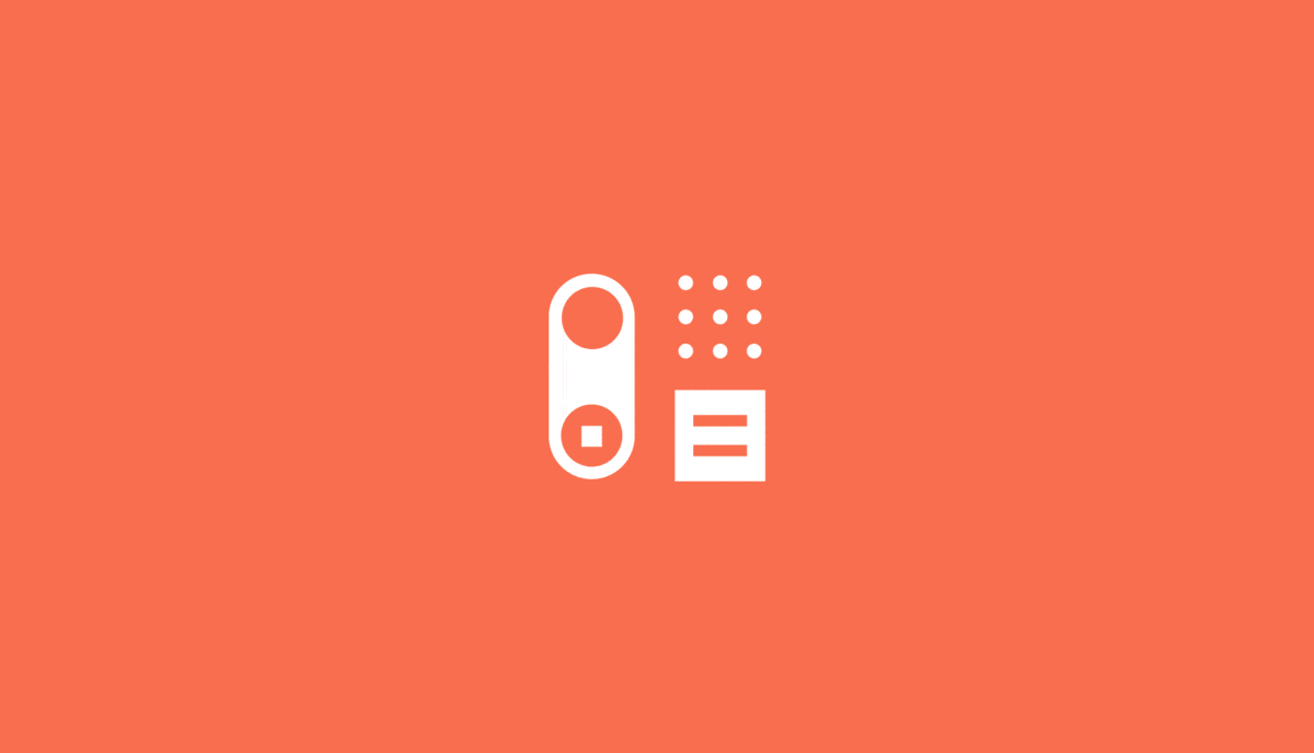
Iconography
We’ve also designed a whole new set of iconography as part of the brand refresh. Inspired by our mark, the geometric iconography will appear in the support docs and as part of the in-app experience.


Our website
We've updated our website to reflect our new brand guidelines. We've applied our new colors, fonts and icons. We've introduced a different illustration style, increased our use of photography and redesigned several pages. But the changes aren't just visual, we've also made lots of usability improvements along the way.
Whether you're trying CRM software for the first time or are switching to Capsule, our website is the ideal place to learn more about our features and find useful resources to help you get started.
Going forward
We're really excited about the next evolution of our brand. It's important to us that our brand continues to reflect who we are as a company and what you can expect from Capsule - the simple but powerful CRM.