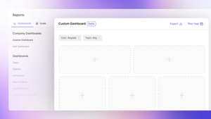
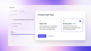
We've got some great news for our customers on the Growth plan - now you can create your own sales opportunity reports in Looker Studio - Google's own business intelligence and data visualization platform.
On the Growth plan, you can already access detailed sales reports on your team's activity, sales performance, pipeline and more. But we know that every business is unique and so there are some reports you’ll want to create yourself. Now you can.
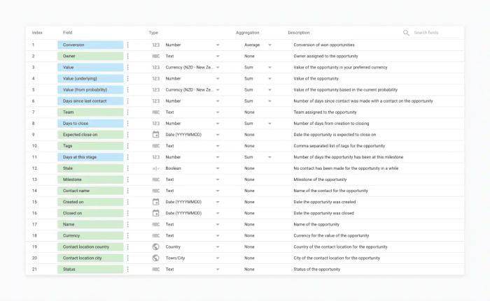
All your sales opportunity data can now be connected to Looker Studio in a few simple steps. We've even added additional data points that we don't usually report on in Capsule, so you get even more insight from your data. Examples include the number of days it takes to close a deal and the number of days an opportunity has spent at one stage.
The great thing about Looker Studio is that you can combine multiple data sources to create a dashboard, which gives you a fantastic overview of your business performance.
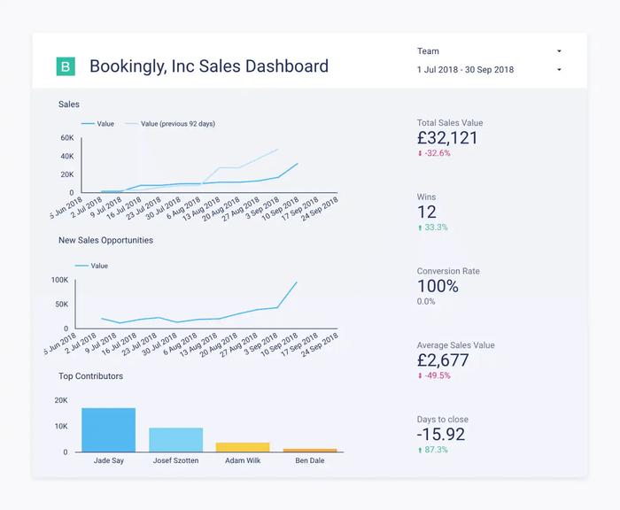
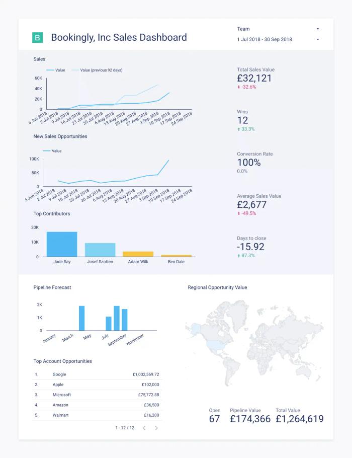
If you’re not familiar with Looker Studio there are templates that help you get started and lots of good support videos too. We put together the template featured below quite quickly to show you what your customised sales opportunity data could look like. Plus, we've put together our own guide to create your first chart in Looker Studio.
Head over to our support portal to read the guide on how to connect your data. If you have any questions or simply want to share your feedback let us know.
