UPDATE October 28, 2014. The new look Capsule has landed
The new look is now live. Many thanks to all our customers that tried it out over the past few weeks and provided feedback to help us iron out any remaining issues. We've included a mini tour inside Capsule on pages where the actions have moved, but if you do have trouble locating a specific function or are having trouble with anything just drop us an email on
support@capsulecrm.com. We are here to help. We hope you enjoy using the new look as much as we've enjoyed creating it!
UPDATE October 13, 2014. The new look Capsule is almost here
We've had great feedback from users including constructive suggestions on things we need to tweak and refine further. We're working on a few final refinements prior to the switch over so users get the best possible experience. As a result we're moving the switch over to Tuesday, October 28, 2014. In the meantime you can try the new look by following [these instructions][support-link]. Do let us know if you have tried the new look as your feedback is really important to us and we want to make sure we've taken all feedback onboard when we do the switch.
We want to make sure we’ve taken all feedback onboard when we do the switch so if you have tried the new look we'd love to hear from you - send your feedback to support@capsulecrm.com.
We'll soon be rolling out the biggest visual overhaul to Capsule since its launch. It is the culmination of many months work and we can’t wait to share it with you. In fact, account admins can start using the the new look Capsule today.
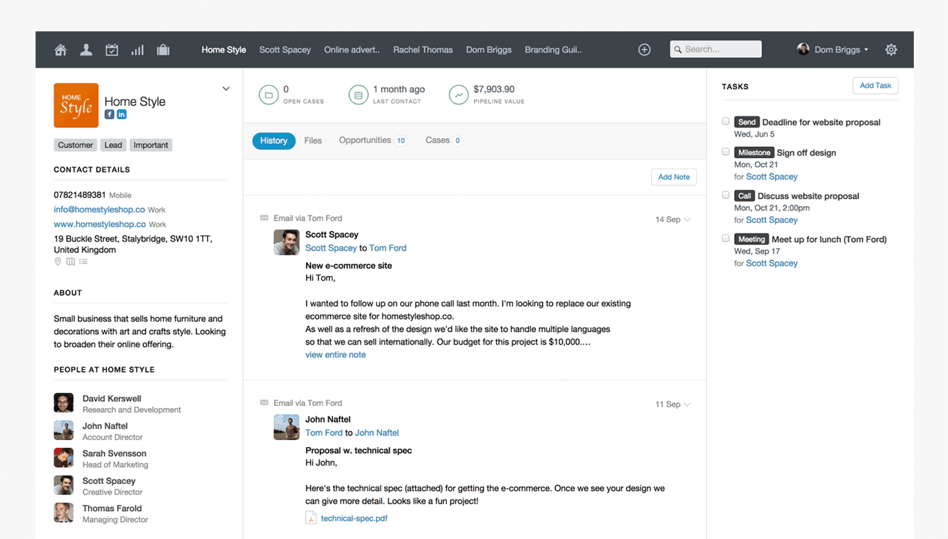
Redesigning the interface is something we’ve taken a great deal of care with. We know that Capsule is loved for its ease of use and maintaining this has been at the forefront of our decision-making. We’ve designed the new interface around the familiarity of the existing look and feel, taking care not to move primary actions or functions unless we believed it represented an improvement to the overall user experience.
Contacts, opportunities and cases have received the most extensive visual changes. We’ve introduced a layout that is more spacious, making content easier to read and allowing you to view information quicker - tasks now sit in a new third column.
We knew that by adding tasks into the third column, this would change how Capsule looks when accessed on smaller screens such as tablets. To account for this, when viewing Capsule on a tablet or narrow screen, you’ll see the third column transform into a slide-out menu - allowing you to show and hide tasks with ease.
A sharper font, more harmonious colour palette and new icons (with support for retina devices) all contribute to an overall cleaner interface. As an added benefit, by reducing the number of images we use across the application, we’ve seen a performance boost when rendering pages.
We’re really excited about the new look Capsule and we hope you’ll enjoy using it as much as we do.